case study
Enterprise compliance analytics
Project overview
One of our flagship strategic products needed a facelift for the newest release of our enterprise software. We knew we had an opportunity to fundamentally reimagine the auditing tools our enterprise customers used for identifying compliance risk.
The product manager, in collaboration with the data science team, came to UX to explore how we could make better use of the available data and our new technology capabilities to offer even more value for our customers. Starting from a core sample of real customer data, plus the high-level vision on the future of the product, we developed a set of design concepts paired with product strategy recommendations.
Experience brief
As per usual for exploration projects, we started by documenting what we learned during the design kickoff in an experience brief. Although the goals were still fuzzy, articulating what we knew and didn’t know helped keep everyone aligned on what we hoped to accomplish with concept design.
- Business objectives – the goal of the product
- Design objectives – the goal of the project
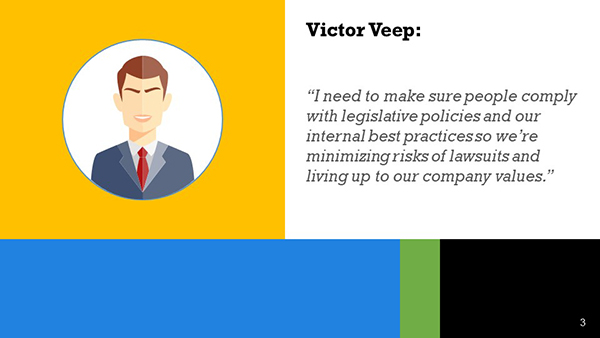
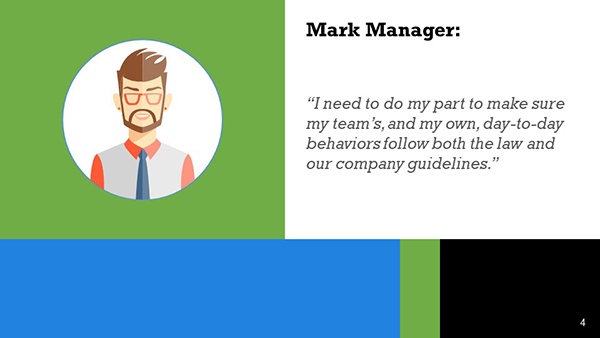
- Primary personas – their roles and goals
- Assumptions – what we know we don’t know
- Risks –
forseeable challenges - Scope – plan for the design effort
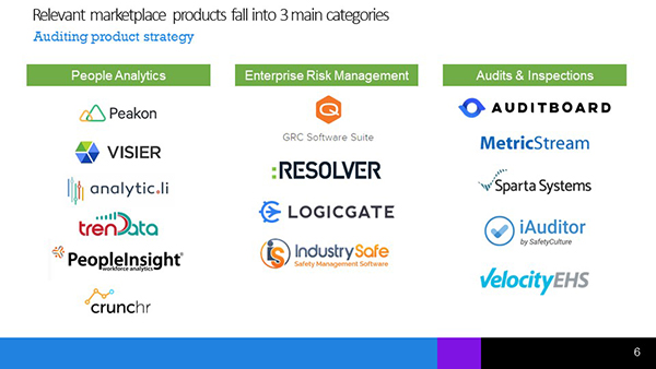
Competitor benchmarking
Since the notion of enterprise auditing was new to the entire UX team, the project team decided to start by understanding the problem space. And more importantly, we needed to identify what expectations from other products they’d have when evaluating ours as a potential solution.
Leadership was eager to “see something” for this high-visibility product, so we didn’t have time for months of discovery research. We had to learn what we could via more nimble methods.
We set out to understand questions like:
- What do big companies need to audit?
- When and where do they audit?
- Is auditing a just-in-time reaction to problems or a deliberate planning activity?
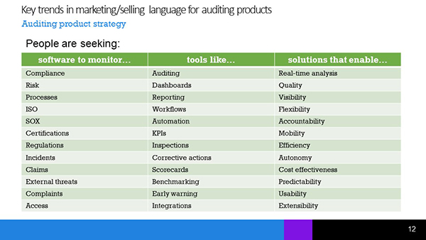
After orienting ourselves to the right terminology–learning what keywords to use to even find competing products–we zeroed in on key categories and started looking at existing solutions.
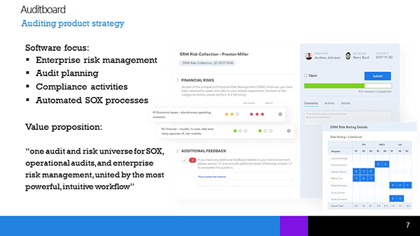
We scoured the websites for related products and found key nuggets of messaging that best articulated the essence of the products. From the words others were using to sell, we could extrapolate what prospective customers demanded from an auditing solution.
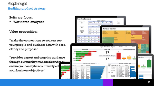
Strategy pitch
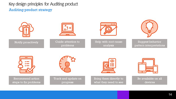
Armed with a “best guess” of marketplace expectations plus the product manager’s vision, we defined a set of design principles that would guide our efforts.
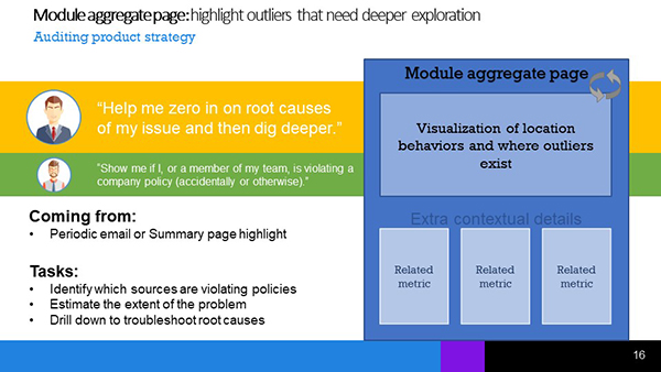
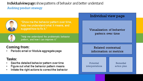
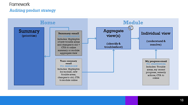
From there, we leveraged the insights from our existing product and produced a set of content archetypes for the 3 main types of pages. We mapped the relationships between pages, showing how each page interacted with each other, and with the
We pitched the concepts to product stakeholders and UX leadership, weaving the stories of what we’d learned from our benchmarking and what we knew of the personas.
For the detailed views we understood well, our designs met the need beautifully. Stakeholder feedback revolved around subtle nuances of terminology. Edits would be easy.
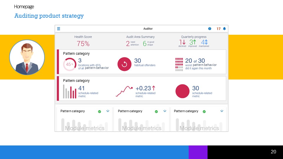
But for the key entry point–the product’s homepage–we’d completely missed the mark. We’d muddle together several complex concepts in ways that left the strategic persona with no clear way to understand what mattered and no clear path to fixing problems.
We’d also devoted too much space to sections where “all is well”, detracting from the ease of solving real problems.
Fundamentally, we hadn’t understood the content well enough.
Data analysis
Our previous level of “we get the gist” clearly hadn’t cut it. This time, we knew we needed to dig in until we understood the complex data more deeply.
We met again with the product manager and the data science team. We needed them to help us understand what data customers care about when trying to perform audits.
We left that meeting prepared to brainstorm how the newly-explained data would translate into a homepage that met the design principles we’d constructed.
But we had a problem. We still just had a bunch of data. We didn’t yet have information, and information had to be the minimum designable unit if we had any hope of providing real value with our designs.
Time to make sense of the data.
After an afternoon slicing and dicing, pushing and pulling, combining and deconstructing bits and pieces of the sample data set we had, insight struck.
Now, we no longer had “a few nuggets of wisdom we could throw on a homepage and trust the system will generate more”, as we had last time.
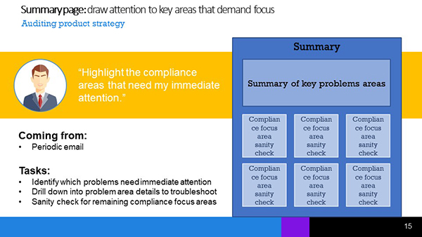
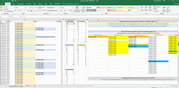
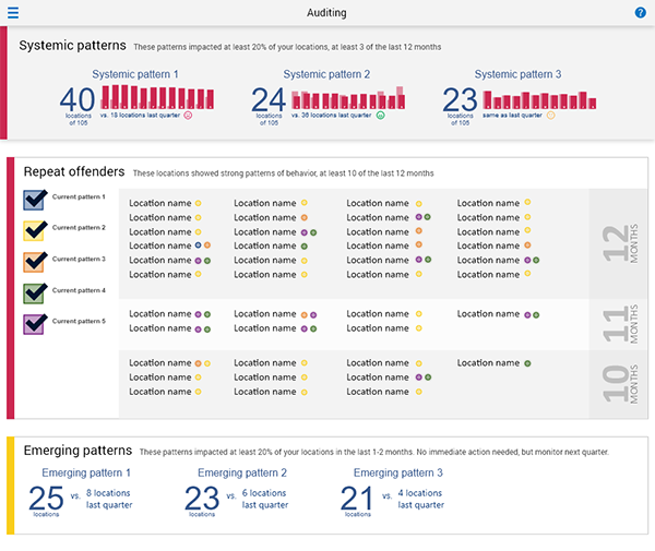
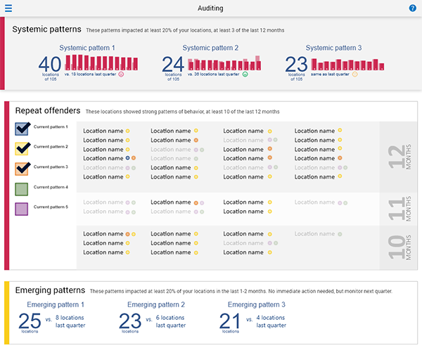
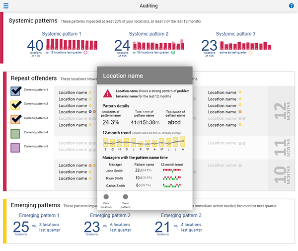
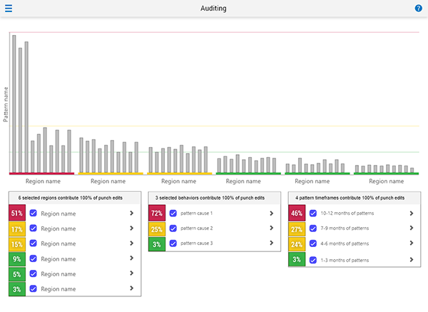
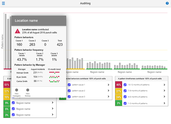
Instead, we discovered 3 flexible, sustainable, meaningful ways of categorizing both current and future data emerged from our analysis that would allow customers to know where to focus attention.
- Systemic problems – problems that impact at least 20% of the organization, and need holistic, widespread solutions
- Repeat offenders – problems that impact specific locations month after month, requiring individualized solutions
- Emerging patterns – issues that don’t yet exceed defined thresholds, but that could become problems if they continue
While each company’s actual problems would differ, as would the thresholds of what constituted a “problem”, the categories were solid.
After validating our newfound understanding with the data science team, we finally had accurate, unambiguous content feeding our design brainstorm.
Design iteration
Without needing to use design time to interpret data, we could finally focus on the more meaningful challenge.
Freshly armed with techniques from Stephen P. Anderson’s Visually Making Sense of Complex Information workshop, we created multiple options for the homepage based on data visualizations that we believed would immediately reveal the biggest areas of compliance concern, and help customers identify root causes, and ultimately, solutions.
After narrowing to the most effective concept, we could move on to validating our concepts with customers.
Stakeholder feedback
Kristin made a brilliant design for [product name]. She made a first draft and took feedback from stakeholders to refine it and also came up with some very innovative and yet simple to understand visuals.
Tools & methods:
- Experience brief
- Competitive review
- Benchmarking
- Strategy pitch
- Data analysis
- Adobe XD prototyping